Happy Holidays (and Holiday Hours)

Christmas seems to creep up on us every year, and this one, we’re extra grateful for the amazing clients and cool projects we were able to work on. 

This holiday season, we’ll be spending time remembering some old favorite gifts (we’re looking at you Furby, LEGOs, Polaroid cameras, and toy trains), cooking so much food with our family and friends, and tinkering with our personal projects.

We’ll be out of the office from December 22January 2, but we’ll be back in action on January 3. If you have an emergency, please email urgent@entermotion.com with EMERGENCY in the subject line! We’ll do what we can do to get back to you without cake mix all over our hands.

Happy holidays!

Entermotion 

Simple but Brilliant

Evenson blog image


Evenson Auctions makes it easy for Kansans to sell their oil and gas assets, and we created a website that was as solid, detailed, and smart as they are.

* We incorporated organic shapes and unique textures to add depth and point of interest

* A limited and high contrast color palette helps us keep a professional tone while making the site easy to read and navigate

Finding a trusted resource for connecting buyers and sellers doesn’t have to be difficult, and with their new website, Evenson Auctions can continue supporting Kansas throughout the auction process. 

A Site Dedicated to Hearing People

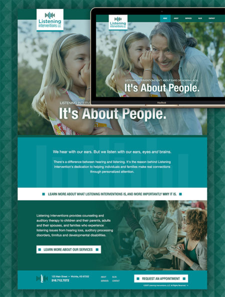
Listening Interventions is a company that helps people connect with each other by listening. Through counseling and auditory therapy, Listening Interventions is the bridge that closes the gap caused by hearing loss. We developed a modern website that would allow people to slow down and listen. 

When there’s a lot of information to move through, readers can get overwhelmed. We wanted to make sure people would be able to understand the information easily, so we distilled Listening Interventions’ content into readable chunks.

We wanted to design a space for the content so the viewer would be engaged enough to actually read all of it. By changing the color and texture of various page elements, and using photo placement to draw the eye to different areas of content, we achieved our goal and made Listening Interventions a site to listen to.  

Subtle animation on the masthead keeps the site playful and engaging without being overwhelming, and we ensured that the site worked easily with our custom CMS so it would be flexible and easy to use while looking great.

See all of the subtle features that make Listening Interventions great. 

Brilliance in Simplicity

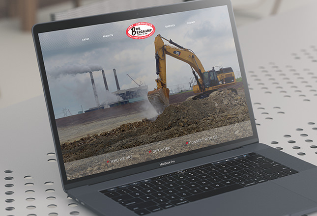
Close up of website designed by Entermotion, Wichita's web design studio, for Bergkamp Construction

Bergkamp Construction was founded in 1955 with a simple goal: to work hard and develop construction projects the right way. When we tackled their web project, we kept their mission in tact, which you can see in the brilliant animated masthead, re-telling of their history, and well organized projects page. 

Their new site features a large picture-based layout that shows off their big goals. We implemented dirt-like textures, a parallax scroll feature, and, of course, a fully responsive site that would look stunning on desktop or mobile devices. Oh, yeah, and we created a cool way for Berkamp to share their narrative– the numbered structure hints at Bergkamps simple step-by-step process to keep construction projects running smoothly. 

We’re excited for this redesign, and we can’t wait to hear about all the new stuff Bergkamp gets up to!


Fulfilling Hayes Company’s Needs

Close up of Hayes Company design by Entermotion, Wichita's website design studio.

Hayes Company offers full supply chain solutions by managing inventory, overseeing temporary warehouses, and managing all those small details that make your supply chain great (from invoices and order receipts to returns and new product roll outs), and they partnered with us to make their website stand out. We swooped in to make sure this was another process that really worked. 

* Links that expand on hover, stories that unfold as you scroll, and a menu that closes up neater than ever are only part of Hayes Company’s new website

* We developed an employment section so prospective employees could find and apply for open positions and admins could easily update position listings 

* We integrated narrative animations so the Hayes Company website could move as well as they do 

* We provided a flexible and modern website which allows Hayes Company to reach more end users no matter their device 


Dec
05

Seen enough? Get An Estimate