Illustrated Guide to Working with a Design Firm
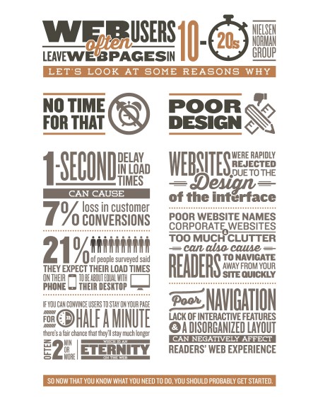
You have a great business. Woohoo! You’ve done the case studies. You know who your target market is. You’ve shared the idea with your mom, and she loves it. What’s next? Well, you’re probably going to need a website. Instead of trying to go at it alone, a web design firm can help you make better design decisions and can design solutions for a wide variety of problems.
Why It Matters
Need an application for your online store? Got it. Want a site that’s modern and a little funky? Got it. Want something corporate and sleek? Yep! A design firm is going to be able to concentrate all of your goals and visions and web-design dreams into one perfectly functional and aesthetically pleasing web package. But some design firms can only do some of what you need, so it’s important to find one that works for you. Choosing a design firm should not be overwhelming! It can be a fun process where you can discover a company or a team who acts like an extension of your own.
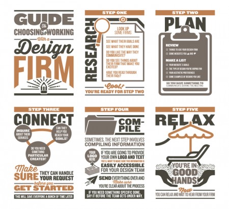
Review our illustrated guide to see some steps to take when choosing a design firm.
*Review things to ask your design firm.
Good luck!
Spotlight on Fisher Lumber
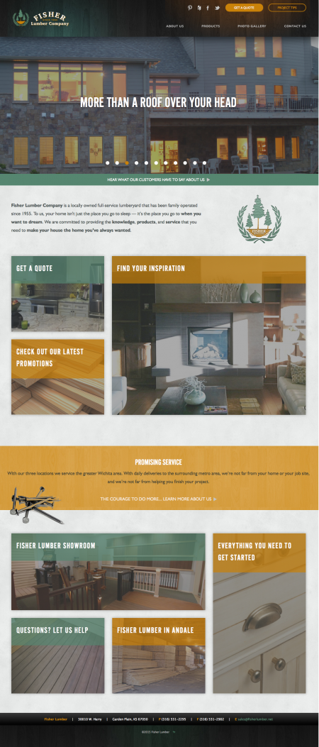
Fisher Lumber is a full-service lumberyard serving the Wichita area. When they came to us about redesigning their existing website, we were excited because we were able to challenge ourselves by organizing and designing a fully functional website that would bring some aesthetics to the lumber world.
Challenge
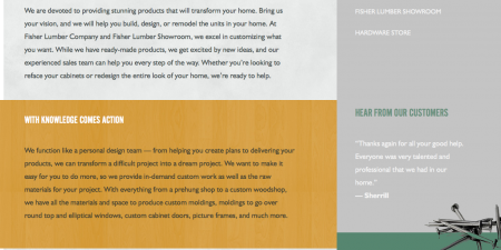
Fisher Lumber has a lot of information to share, and we wanted to make sure that everything was easily accessible. We pulled from the orange of their logo in order to incorporate a unique accent color that would make it easy for customers to spot important links, highlights, and sections. The mint/pistachio green from the logo was extracted and reintegrated as an accent color to suggest a cohesive design that reflects Fisher’s wholesome, family-oriented mission.
Solution
A bold site that organizes information hierarchically, making it possible for customers to search and find Fisher’s products and resources quickly.
With color-blocked categories, all of Fisher Lumber’s sections became easy to navigate. Customers can find project tips, testimonials, products, and services quickly. And since Fisher Lumber is all about transforming the home with ease, we wanted to make sure that their site presented their knowledge, skills, and accessibility prominently and with ease.
Font
Frequently used in news sites, billboards, and papers, the Alternative Gothic and Roman fonts made Fisher’s most important information easy to read.
Organization
With three locations, a hardware store, a woodshop, and a cabinet shop, Fisher Lumber has a serious amount of information and a slew of products, specials, and deals to promote. We organized this site so that Fisher’s deals, products, and specials were only a click away, no matter where you were on the site.
Colors
The orange, forest green, and gray colors were all pulled from Fisher’s logo, which represents their local, earthy ideals, their quality materials, and their family-centered approach to their lumber company.
Lasting Connections
Fisher is all about forming lasting connections with their customers, so we included social media favicons to make it easy for their customers to stay connected.
From their custom images, informative, color-blocked sections, and easy to navigate site, Fisher Lumber is ready to deliver lumber products to the Wichita area. Check out their new website here.
Happy Thanksgiving
Thoreau once said, “I am grateful for what I am and have. My thanksgiving is perpetual.” We like to chew that over as we’re sipping tea, working on projects for our clients, spending time with family, or just existing. Although we try to remember to be consistently thankful, we know that it’s important to express that thanks because, hey, otherwise you might not know!
We’re grateful for the successes of our clients! Knork made Oprah’s list of Favorite Things on Amazon; Atlas.md launched a direct care curriculum to help potential direct primary care providers learn the ropes; Midwest Health Group is accepting new patients; and Raise my Head had a well-written and well-deserved profile created about them in The Wichita Eagle. All of our clients are wonderful, and we’re thankful that we have the opportunity to work with you!
Oh, and we almost forgot! We’ll be out of the office on Thursday, November 26 and Friday, November 27 so that we can celebrate and spend time with our friends, family, loved ones, and maybe even some personal projects. We’ll be back at it on Monday, November 30th!
Happy Thanksgiving from the EM family to yours!
(Did we miss you? Send any successes to info@entermotion.com so we can share in the excitement with you!)
