Think Like a Writer

Faceless man picturing typewriter.

A lot of us run creative businesses, and we know how to deal with the daily tasks, how to field all of the emails, and how to manage a team, but sometimes our ideas get lost whenever we try to write our web copy. Why?

The worst websites have copy that doesn’t accurately represent their brand.

We see this all the time. Your innovative company is breaking new ground; you’re pioneering some wild ideas. Your team gets together every year to celebrate in exotic locations, and you’re always coming up with weird ideas that challenge the industry. Congrats. Look at you go. But your web copy talks about the same old ideals of customer service, loyalty, and honesty. 

You might be thinking, “well…yeah. We are honest and loyal, and we love customer service. What’s wrong with that?” A lot of that is wrong. Here’s the deal. All companies that are in the business of making money are also in the business of customer service. All companies that want to make money stay loyal. Most companies act honestly. Those aren’t interesting or valuable. And they aren’t going to make people consider your product or services. 

Consider being real.

Instead of throwing down some tired ideals, consider getting real. What do you really wish for your customers? What do you really think is going to happen if they buy your product? If they don’t? Your customers are going to trust you a lot more if you tell them what they need to know without the sales jargon and the BS. Without the pretty veil of fake-selling. Just tell them what’s up. What you can offer. Boom. They get the truth and they get it in a way that they like. 

Find your true self.

You don’t have to meditate for hours, and we’re not going to tell you to hide out in the woods somewhere. But it is important to find your company’s real values before you update your copy. 

To think like a writer, you’ve got to think about purpose. All writing is about purposefully communicating your ideas in a way that people will understand. And you can’t do that unless you know your purpose. 

Here’s how you can get closer to writing real copy. 

Quick brainstorm session.

You’ve done brainstorming before. But have you done lightning speed brainstorming? This is when you don’t stop writing for an entire five minutes. Pick a song that runs for five minutes. May we suggest Zepplin’s “Black Dog.”

(Go ahead and play the song twice if you need!) 

Pick up pen or get ready to type.
Press play on the song above or start your timer.
Start writing. Don’t stop.
That means no backspace.
No deleting. No erasing. No censoring yourself.
To begin, answer the following questions.
Feel free to skip or add whatever you want.
Whatever you do, don’t drop your pen until you’re done. 

  • How would I describe my brand to a 5-year-old kid?
  • How would I describe my brand to a cool 5-year-old kid?
  • How would I describe my brand to my best friend’s mom?
  • How would I describe my brand to someone who hates my products?
  • What are three actions that my brand hates?
  • What are three actions my brand loves?
  • What does my brand actually provide our customers that other companies don’t?
  • What does my brand aspire to be in 5 years?
  • Why does my brand matter?
  • What are my brand’s values?

Take it to the team.

Cool. So now take that freewrite activity and bring it to the team. Ask them to participate. See how your answers differ. Where are they the same? Are there values your team thinks are more important? Once your team answers the questions, you can collectively explore what values seem most like your brand. Then see if you have evidence to back it up. Collect testimonials, reviews, actionable goals that can back up your values. 

Translate it to web copy.

Now that you’ve all agreed upon your company’s values, you can figure out how to translate it to web copy. We suggest freewriting and organizing to come up with a solid plan. We like to use Jumpchart to plan and organize our web copy, and it’s a good way to collaborate on web projects. If you’re struggling to figure out how to translate your ideas to copy, check out some of our tips:

Check your tone:

Let’s say you figured out your values. Let’s say you’re a new startup and you’re quirky, young, and causal. Cool. Rock it. Let’s say you want to start writing your web copy, and you draft a sentence like this:

Gelly is a trusted gel shoe product that transforms the ground into a comfortable oasis. Feel the dream.

That’s cool, but the tone isn’t really quirky, fun, or young, is it? It’s sort of formal. With words like “transform,” “oasis,” “product,” and “trusted,” we get a very solid idea of a company that is sort of stiff, traditional, and loyal.

 Now what if you write:

Gelly’s gonna make your feet feel radical. Be cool when you run, stay dry when you walk, and gel with your friends while you dance. 

The words in this version are a bit more relaxed: “radical,” “cool,” “stay,” “gel,” “friends,” “dance.”

When you’re writing your web copy, highlight the adjectives and verbs and make sure they’re reflecting what your brand’s about.  

Sweat the details.

So you have your web copy ideas and your tone, and that’s great. But to really make a difference, you’ll want to sweat the details. There are a ton of spaces (besides the main web copy) where you can infuse your tone. 

  • About us page – make sure your new about us page copy reflects the tone, ideals, and vision that you explored above.  Check those verbs and adjectives. 
  • 404 page – there are some great examples of hilariously innovative and awesome 404 page copy. 
  • Footer text – you don’t have to keep your footer text bland.
  • Emails  – we could do a whole ‘nother blog on drafting cool email texts, but if you don’t have time to rewrite all your emails, consider rewriting your subject lines and see what happens. 

So go ahead. Figure out your values. Be the brand you’ve been meaning to be. Make your momma proud. We believe in you! 

Adjust Your Reading Level for a Human Interaction

Faceless Man Reads a Book and Learns About Reading Level

Even if you’ve gone to college, you probably don’t come across college-level texts in everyday life. A lot of what you read every day is probably at a pretty low reading level. Why? Because most audiences don’t read at a college level, so most writers avoid writing a college level. And most generalized websites aren’t going to write something that their audience can’t understand.

Usually, when we write, we want to reach the broadest audience possible.

What’s your reading level?

The amount of words you use to say what you want, the types of words you use, and the way you combine those words can all change the reading level of your text.

Mental Floss ran a test of some popular blogs to see what reading level their text is catering to. They found some interesting stuff. Hilary Clinton’s blog, for example, is writing at a college level, while Arts & Letters is writing at a middle school level, and the Damn Interesting blog is writing at a genius level. So what’s the sweet spot?

Well, first we should look at what reading level most American adults feel comfortable with, since they will likely make up your audience. According to Huffington post and a study conducted by the U.S. Dept. of Education, “32 million adults in the U.S. can’t read. That’s 14 percent of the population. 21 percent of adults in the U.S. read below a 5th grade level, and 19 percent of high school graduates can’t read.”

So it’s already clear that you probably shouldn’t write at a 12th-grade reading level if 32 million adults can’t even read, right? Let’s take a look at our own score first.

Readability score for Entermotion's blog.

  •  The Gunning-Fog score is based on the amount of years of formal education a person would need to understand your text. 9 means we are writing at a 9th-grade education level.
  • The Coleman-Liau Index is based on characters (not the amount of syllables) found in each word, and the result reflects the grade level, so based on our characters, we’re at a 11.3 grade level.
  • SMOG index is supposedly more accurate than the others, according to the Journal of Reading. The SMOG index is based on the number of sentences and the number of syllables in each word. SMOG is used mostly for healthcare materials, and we’re at a 9th-grade reading level there too.
  • The Automated Readability Index is like the others. It shows that most 12-year-old readers could understand our blog.

What’s a common reading level?

 According to the Readability Score website, the general public reads at an 8th-grade level. It looks like we’re sort of circling right around that sweet spot. There are some other blogs that are following along pretty nicely too!

Test thanks to http://www.webpagefx.com/tools/read-able/. Test thanks to http://www.webpagefx.com/tools/read-able/.
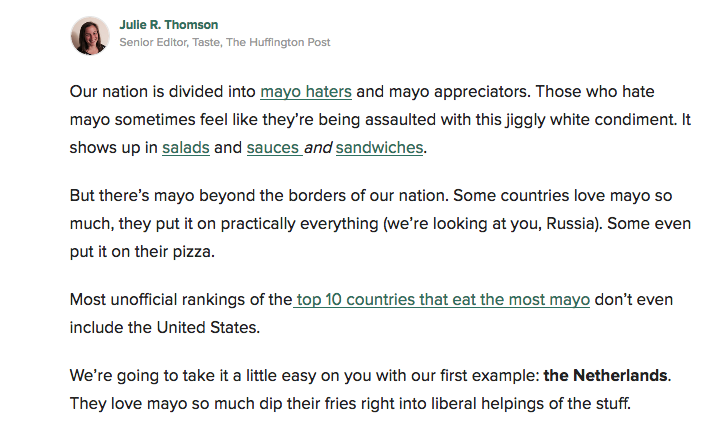
So what does an 8th grade reading level look like? Let’s take a peek at an example from The Huffington Post.

 See what Huffington Post's reading level looks like.

Notice anything? How about the types of words used: weird, holy cow, stuff, shows, love…These are all words that everyone can understand. Huffington Post’s writers use common language. Words and phrases like “stuff,” “don’t even” and “a little easy,” make the text feel comfortable and easily understandable. That’s the goal.

Find Your Reading Level

Double check your reading level using one of the programs below.

Readability Score
Online Utility

Adjust Your Reading Level

Once you find your reading level, you may need to make some adjustments. If you’re writing to mass audiences and your writing is at a college level, you may need to simmer down a bit. Some websites have been designed to help you identify your reading level for a curriculum, but if you’re creating text for the general public, you may need to do a bit of work.

The Journal of Extension provides some good tips for writing text for low-literacy and lower-literacy audiences:

  • Make your sentences shorter
  • Avoid 3-syllable words when possible
  • Use bullet points
  • Incorporate quality headlines
  • Use images when possible
  • Place most important text up front
  • Use active voice (subject > action > John goes shopping. Passive voice: The shopping was done by John).
  • Avoid double negatives
  • Avoid synonyms (use the same word when possible)

 So go ahead and try out different tactics. See what works and what doesn’t. And when in doubt, write like you’re talking to someone’s grandma. Even if the concepts are complicated, the language doesn’t have to be.

How to Use Psychology to Sell

How to Use Psychology to Sell

Remember when you were little and someone offered you an ice cream bar now or two ice cream bars later? Which would you take? Probably the one right now, because the only thing better than an ice cream bar is an ice cream bar now. This is what sales dudes and dudettes call “hyperbolic discounting.” And it can change the way you sell products.

Hyperbolic discounting messes with everything from your morning workout to your desire to purchase something today. It’s the principle that suggest people would rather have a lower immediate reward instead of a higher reward that they have to wait for. It’s that thing that makes you hit snooze even though you made a plan to work out at 5 a.m.

People will usually give up the extra ice cream bar later for the immediate award. But if there’s a large time period in between the first possibility and the second, people are more likely to hold off for the better reward. Most people will choose $10 now instead of $15 next year. But they would take $15 in 16 years vs. $10 in 15 years.

“With hyperbolic discounting, the rate of discounting decreases as the delay occurs further in the future…the amount a future reward is discounted depends on the length of the delay and when they delay occurs.” Behavior Lab.

Don’t Snooze on the Psychology to Help You Sell

The Stanford Marshmallow test gives a good visualization of this principle. In the Harvard University study (1960), children sat with a marshmallow and the option to eat the marshmallow now or wait 15 minutes, when they would be given another marshmallow. The findings seemed to indicate much more than a sweet tooth.

Surprise! The kids who waited 15 to eat the marshmallow grew up to be adults who could refrain from immediate gratification– (and they scored better on tests, had lower rates of obesity, and earned more money than their marshmallow-now-please eating counterparts).

In other words, the discount is accepted it if rewards our short-term needs, and most people make purchasing decisions based on that. Most of your customers are marshmallow now kind of people.

Examples of this Principle in Copy

luckypeach
 

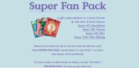
Lucky Peach knows that people are going to act now when they can. So if they can save money by purchasing a subscription today, and if that option ends after the holidays…then yeah! People are going to get a move on it now.

lifeproof

Lifeproof tries to hit your emotional center with words like free shipping now. Words like “today only,” “act immediately,” or “one-day sale” might help people make the purchasing decision that they’ve been holding off on for a while.

josie

Even beauty brands use this principle. If it’s the final hours, our need for the short-term reward kicks in. According to a Princeton study, “preferences for short-term rewards result from the emotion-related parts of the brain winning out over the abstract-reasoning parts.” So people are making purchasing decisions with their emotional side, not their logical side. When you write copy, then, it makes sense to appeal to their emotional side.

When More is More

We have shopping malls full of more. Our homes are full of more. If you open up any old magazine, you’ll see it over all the pages. More is more. And people like more, so they probably like to have a lot of options when they shop, right? Nope! This is where psychology comes into play. While a lot of customers might like the idea of excess, when faced with a sales decision, it’s best to keep things simple.

Analysis paralysis occurs when we’re faced with too many options. You know when it’s like when you go to the store and you find 45 different versions of the same type of chip. Which do you want? What if you go for the blue packaging that’s a little cheaper when the red packaging might have the better chip? What if you buy two of the same type instead of three different types? What does it matter? The thought of facing all of those decisions can be overwhelming, even if it’s just over something as silly as a chip.

Reduce Paralysis

You’re more likely to make a purchase when you’re faced with fewer options. In this jam study  people were more likely to make a purchase when faced with 6 products instead of 24 of 30. Take the copy below for example. There are limited choices, so you make it easier for your customers to decide.

Carbonite Sales Plan

But what happens if you have a lot of choices and you want to give your customers the best possible experience? You can still  present all the choices, but you may want to hide a few of the less popular ones so users don’t feel overwhelmed.

Paul Boag suggests that we must “default to the most common choice while allowing the option to customise.” If you want to make this principle work in your copy or your website, make sure you think about a few things:

Provide one offer in each email campaign. Why? So your customers have a single decision to make. Purchase the product or don’t.

 graze

Graze has one offer in this email, so it’s pretty easy to make a decision. There’s really only one thing you can do in this email. Okay, I guess there are two things. Either click to get your free box, or click to close the email. Based on the jam study, this is a pretty dang good sales idea, so remember. If you have 100 types of products, that’s cool. But try focusing on a few of those (or even one of those) for every email blast. Track it for a while and see what happens.

 peel-super-thin-iphone-cases

Peel knows the deal. When customers come to their home page, they’re faced with one single option for each type of platform. That doesn’t mean they don’t have more options. It means that they hid those options until they were necessary.

Combine Tactics

Create a big impact by combining tactics. Hit the immediate gratification center, but offer fewer rewards. See how it changes your sales. And, as always, check out your analytics to make sure your customers are able to easily access your products or services. Because none of this will matter if people can’t even find the check out button!

Holiday Hours

holidays012

Happy Holidays! We’ll be celebrating by warming up inside by the fire, sharing these prewritten cancellation excuses with friends of friends of friends, and playing with all of our kids’ toys because hey…the holidays aren’t just for children! We’ll be out of the office on December 22 – January 2, but we’ll be back in action on Tuesday, January 3.

We try not to check our emails when we’re on break, but if you have an emergency, email us at urgent@entermotion.com . Our smart email filters will send your message our way and we’ll take care of everything as soon as we can. Otherwise, we’ll see you after we eat all the pie.

What’s Up With a Revamp?

whats-up-with-a-revamp

Staring at the same website for 1825 days can get a little boring, so we were really excited to take on a redesign of Atlas MD’s website. There’s a lot to think about during a redesign, and we wanted to talk to you about some of the main points to consider before planning a redesign.

Refocusing for a Redesign

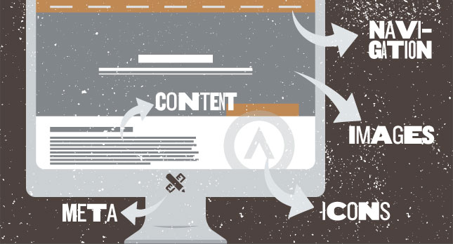
Content – Is your content working or are you thinking about a rewrite? For Atlas MD, we left a lot of the content the same. Why? Because it was working well. And you know what they say…if it ain’t broke. But the best way to tell is by feeling it out. Do you like the way your content sounds? Does your content sound like stuff you’d actually say to customers, or is there a big difference between what you say and the way your text sounds? If so, you’ll probably want to revise the text. We believe that the design should follow the content, so we always clean up the content before we do anything else.

Navigation – How are people navigating your site? Review your Google Analytics account and see how people move through your content. Do they get stuck on the home page? Are they struggling to get from the “About” page to the “Contact” page? If you’re noticing any lags or any strange patterns, it may be a good idea to adjust your navigation.

Images – Are your images high-res? Do you include proper tags for SEO purposes? Your images may not be outdated, but you still may want to consider some improvements. Think about incorporating alt tags so you can show up in search engines and help the visually impaired experience your content. If you haven’t been receiving the type of response you want from your customers, you may need to re-examine your images. Sometimes, a small change can make a big difference. If you’re struggling to know what’s best, you can always A/B test it.

Icons – For such a small part of your site, the iconography can have the biggest impact. Do you incorporate custom icons? Can people actually tell what the icons stand for? If possible, do a little review of all your icons. Separate them from the text and see if they’re working properly. Ask your friends and family for input. Maybe they see something you don’t. When in doubt, connect with your design firm. They can tell you whether it’s time to reimagine your icon concepts or whether they’re still working properly.

Meta – Since you’re redoing the site, it’s a good idea to get your meta in order. Check out some of our previous posts on SEO and keywords and see if you’re doing everything you need to get the rankings you want. Sometimes, all it takes is some fresh eyes, new research, and some meta tweaks to get your SEO rankings up. Remember that, like most of the web, SEO isn’t a static thing. You should keep monitoring it to make sure it’s functioning the way it should.

See how we redesigned Atlas MD’s clinic website — we looked at their content, rewrote their meta, adjusted their images, optimized their text, and made the whole site shiny, but we left a lot of the bones the same. Sometimes you have to redesign from the inside out, but sometimes, you just need  fresh eyes and new design elements to get the results you want.

Seen enough? Get An Estimate