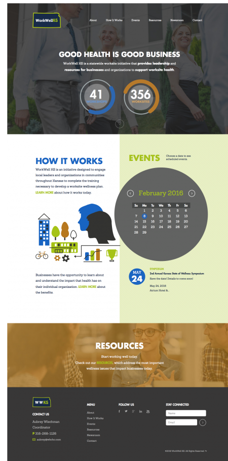
You know the book Don’t Sweat the Small Stuff by Richard Carlson? We love that book for its chunks of wisdom (“Pay attention to your joy, that feeling will grow.” (Don’t Sweat). What’s not to love, right? But we’re in the business of design, which means we pretty much do sweat the small stuff. And the not-so-small stuff. And the hey-why-doesn’t-your-logo-match-your-brand stuff. Today, we’re excited to announce the launch of Health ICT’s new site, which allowed us to sweat all of the small details that we love.
We Perked Up for Health — And For Modern Icons…

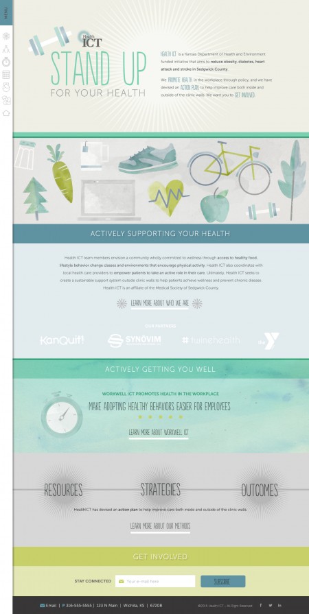
HealthICT is a Kansas-based initiative that seeks to reduce the cases of obesity, diabetes, heart attack and stroke in Sedgwick County. We created an educationally relevant and graphically imaginative site that would pull all of their information in one navigable site. And while we did that, we were most excited about the watercolor feel that we gave to the pages. We’re always happy when we can combine our childhood dreams of paint and water with our restraint and reverence for clean designs.
So Many Wows, So Little Time
Every design team probably has that wow moment. And probably all employees of any type of company have that wow moment. The moment where you realize exactly how cool the project you’re working on is. That wow moment came for us early on. When we were designing, we had visions of old-school educational documents, vintage posters, and a light color palette that brought us back to the school locker room — where we could get fit and learn something new.
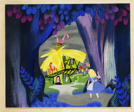
Check out their new site here, and when you’re pumped to get healthy, you can drool over these vintage posters from the New York Public Library for more inspiration!
