Use Someone’s Image? That Could Cost You!
Those free images you find online aren’t “free,” they are not for your use, and you can’t just “borrow them,” even if you don’t know the rules. Say what? We’ll break down some misconceptions and give you some insight on what’s up.

Creator  

When you create an image from an original idea, you own the rights to it. It’s that simple. You can use that picture however you want– you can place it on billboards, distribute it in brochures, and share it with your friends. That’s cool. There are no restrictions. If you want to give other people access to it, you can register with Creative Commons and pick your licensure level. This will ensure that your image is properly protected.

Freely Licensed

“Freely licensed” is what happens when someone gives you permission to use their work. Some stock photos are freely licensed, that image your aunt Mary took of your cousin Paul at your sister’s wedding and then allowed you to use is freely licensed. Some images, like the ones on Pexel, are filed under Creative Commons Zero license (CCO), which means you can use them as you wish. Photos that are filed under this license will say that they’re available under Creative Commons Zero. 

Public Domain

Images in the public domain are free of copyright. That means you can use them, distribute them, share them for commercial use, whatever. If a work is in the public domain, you can use it without asking permission from the owner. To see when works pass into the public domain, check out Lolly Gasaway’s helpful chart. 

Fair Use

Fair Use guidelines let people use images if they are to be used for certain reasons:

  • Criticism
  • News
  • Teaching 
  • Scholarship

Before you go printing out copyrighted images for class, check your use against Section 107 on Fair Use, thanks to Cornell’s law website.

Creative Commons

Some images are protected under Creative Commons. Creative Commons was created to give people a middle path, so to speak. They created a standard way for creators to “retain copyright” while distributing their work safely. Creative Commons has six licenses– the most lenient one allows people to “redistribute” your work “commercially and noncommercially” as long as they give you credit. The most restrictive one allows people to share an image (unchanged) with a friend, but they must cite the creator and they cannot use it commercially. 

We need to set out some ground rules here:

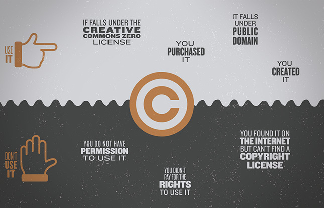
Don’t Use It If:

  • You found it on the Internet but can’t find a copyright license
  • You didn’t create it
  • You do not have permission to use it (and if you do, you’ll want to make sure it was freely licensed to you by the creator of the image)
  • You didn’t pay for the rights to use it
  • You are hoping to distribute it commercially but can’t find licensing information

Use It If 

  • You created it
  • You purchased it 
  • It falls under the Creative Commons Zero license
  • It falls under public domain

Can you just cite it?

Nope. If you want to use an image, but you don’t fit one of the fair use criteria, citing it isn’t enough. It’s nice, but it won’t remove you from copyright laws.  

What if you didn’t know?

It sort of doesn’t matter. In any case (whether you knowingly performed copyright infringement or whether you made a mistake), you can still be fined. According to Purdue, the fines can vary greatly.

The legal penalties for copyright infringement are: Infringer pays the actual dollar amount of damages and profits.

  • The law provides a range from $200 to $150,000 for each work infringed.
  • Infringer pays for all attorneys fees and court costs.
  • The Court can issue an injunction to stop the infringing acts.
  • The Court can impound the illegal works.
  • The infringer can go to jail.

Best case scenario is that the owner requires that you take it down. Worst case is up to a $150,000 fine and lengthy court cases or jail time. Whenever you work with a design studio like Entermotion on a website or a brochure, we purchase the rights to the images that we incorporate on your site, so you don’t have to worry about infringement.

If you’re creating your own website or sourcing your own images, make sure that you’re careful. You don’t want to wake up to a scary cease and desist email…or worse


How to Make Marketing Feel Good

How We Can Make Marketing Feel Better

According to Telesian’s blog, we see about 300-700 ads per day. CBS thinks we see as many as 5,000 ads per day. Whatever the actual number, it’s a lot, but amidst all the clutter, there are a few companies that stand out for representing what other people are not. 100 Ideas That Changed Graphic Design knows what’s up:

Promoting the image of a company rather than its products or services is sometimes the smartest business decision.

Companies That Promote Their Ethos

Marketing doesn’t have to be icky, in-your-face salesy bs. Some companies are subtle in their marketing approach. Some try to think like a writer. Some like to get really innovative with a simple idea. See how Leica promotes a feeling vs. the benefits of their product in this long ad.


The Most Boring Ad Ever Made? from Leica Camera on Vimeo.

What’s the Big Difference?

Everything. When you market a feeling, an ethos, or a belief, you’re speaking to a different part of the customer. You’re not trying to reach their mind or their pocket. This isn’t really a direct marketing approach, as it can take a while for an innovative idea or subtle marketing approach to really sink in, but when it does, it can be super effective. 

How Coke Did It

Some corporate companies have the means to do things a little differently. Take Coca-Cola for example. Unlike traditional advertisers, Coke uses their products to promote an ethos.

This is what marketers call “institutional ads.” Coke had a revolutionary idea that they called “Project Connect.” You’ve probably seen some of these Coke bottles with phrases like “Share a Coke with [name here].” 

Institutional advertising promotes the company, corporation, or idea. It doesn’t really sell anything directly, and that’s why we’re into it. 

People love to share personalized gifts, and when it comes from a corporate brand like Coke, it’s even more exciting. 

AdWeek mentioned that Coke’s personalized bottles helped sales grow for the first time in 10 years. According to AdWeek, they never thought their campaign would have that sort of impact.

The campaign was never intended to mark a permanent change to the soft drink bottles, and already, Coca-Cola is beginning to phase them off shelves. But a senior brand manager for the company has said there will be “serious consideration” given to bringing it back again in the United States next summer.

Coke shared Lucie Austin’s interview about what spawned this idea:

LA: Our research showed that while teens and young adults loved that Coca-Cola was big and iconic, many felt we were not talking to them at eye level. Australians are extremely egalitarian. There’s a phrase called “tall poppy syndrome.” If anyone gets too big for their boots, they get cut down like a tall poppy. By putting first names on the packs, we were speaking to our fans at eye level. 

It wasn’t really about marketing. Their idea was much more subtle. Show people they matter. And they’ll respond well. Lucie noted that the team ran with some new changes:

Originally, the idea was conceived with the names printed in the traditional “Coca-Cola” Spencerian script. We couldn’t do that due to trademark issues, so we created a brand-new typeface inspired by the “Coke” logo. We call it the “You” font because it’s about you, the consumer, not Coca-Cola.

Like the Coca-Cola movement, there are a lot of marketers making bold statements. McCann and the State Street Global Advisers got down with institutional ads by honoring strong little girls everywhere when they dropped a bronze statue of a girl staring down the bronze bull on Wall Street. Over night. Talk about a statement

Why It Works

Why does stuff like this work? For a lot of reasons. People like authentic. They like to know that they’re purchasing products from brands that actually care about their well-being, and one way to do that is to show people that your brand does more than just exist. 

What’s Best

We can’t tell you what you should do for your company. We can only tell you what we think is best.

  • We think it’s best to connect to real people in a real way
  • We think it’s best to trust yourself and your company
  • We think it’s best to try new things, even if you might fail
  • We think it’s best to subtly market to your audience

 Is your company doing anything innovative? Do you have a new product that can actually change people’s lives? What if you flipped marketing on its head? Instead of marketing the features, market the feeling.

Apple has been notoriously good at this: 


You Only Need One Thing to Market

A story. And..well..yeah…a product or service would be cool, but it’s your story that people care about, and it’s your story that will pull people in. So go ahead, get to talking, doing, and sharing. We can’t wait to read all about it. 


Why Human-Centered Design Matters

According to Ideo and their Field Guide to Human-Centered Deign, “Embracing human-centered design means believing that all problems, even the seemingly intractable ones like poverty, gender equality, and clean water, are solvable.” To incorporate human-centered design, you have to understand who you are designing for. This is the design that solves regular old problems (like how the heck do we know whether to push or pull or a door or how to create ergonomic scissors) and really big problems (how to get clean water to communities). It’s more than just product design. It involves empathy, understanding, and (maybe most importantly) flexibility. 

If you need more reasons to support human-centered design, we got you. Even David Kelley, a managing partner of the design firm IDEO thinks human-centered design is cool.

How to Integrate Human Centered Design

According to Design Kid, human-centered design includes inspiration > ideation > implementation.  

Inspiration: The first part of human-centered design is listening to the people you’re hoping to serve. Make sure you are adjusting your reading level for your audience. If you want to create a new way for people to drink water, you’re first going to want to understand what they’re doing now, why it is or isn’t working, and what they actually want. But this sort of design-think can apply to more than humanitarian needs–everything from cups to underwear can be designed using a human-centered method. 

Let’s say your job is to engage students at your school. How do you approach the problem? Some teachers would start by teaching their lesson plan as it is. But others would leave space for feedback. What do the students actually want? Are they dying to experience more hands-on activities? Are they begging for more time for play-centered learning? Do they ask you daily to get into group activities? It might be time to listen to them for once. The best way to integrate human-centered design is to taken notes. And finally, leave room for innovation. Notice whenever someone says something about your project. Notice how real people are attempting to use your product, even if it’s not the way it was intended. Listerine, for example, was first developed as an antiseptic; it wasn’t until the 1920s that it found its perfect form– as a halitosis cure. 

Ideation: Take your information from the inspiration phase and come up with as many ideas as you can. Prototype them. Test them out. See what works. Ideation is like a giant brainstorming session. There’s no wrong way to brainstorm, though there are some tried and true techniques that you can explore during your ideation phase. 

Implementation: This is where you can keep your goals in mind while you attempt to implement your design solution into the area you’re trying to serve. After you implement the new plan, leave room for feedback. 

When you’re working on a tangible product, the humanness of it can come a bit easier. You can imagine how real people will actually use it. Take the door, for example. Vice recognized that there are bad doors all over the place. A door is the kind of object that gets forgotten about pretty easily…when it works properly. But when it doesn’t? You get a whole lot of this:

The Norman Door is named after Don Norman…you know… he’s just the dude who helped create the Nielson Norman Group (!!!). And it’s what happens when designers don’t think about use. A Norman Door is a door that has such poor design, you don’t know whether it’s a pull door or a push door. And like the Vox video says, if you keep messing up a door over and over again, it’s probably not your fault. Good human-centered product design looks a little something like this:

Montblanc pen

Some designs haven’t changed much since their first iteration. That’s not because no one is innovative; it’s because the design is so perfect that it doesn’t need to change. The nib may have gotten narrower or wider depending on use, but there was always ink flowing somehow into a nib. In the 1880s, Alonzo T. Cross applied for a patent for one of the first iterations of the ballpoint pen. This design used air bubbles to push ink to the nib. Users no longer had to dip their pens in ink.  In 1888, another guy named John J. Loud launched the first ballpoint pen into the world, and it’s been smooth sailing since then.  

Safety Razor

This safety razor from West Coast Shaving is a good example of design that blends human-centered design and stunning aesthetics. The safety razor was easier to use than the previously common straight razor, and it led to a whole nation of young people dreaming of shaving. Without human-centered design, the razor may have never evolved into the safe, sleek form that we’ve come to love. 

Human design helped show a company why their treadle pumps weren’t selling (hint: the hip-swaying involved in the operation was deemed inappropriate in the cultures they were trying to sell to). It’s what makes people think about each other when designing offices, and it’s what turns algae into a life-saving product. The book All Marketers Are Liars by Seth Godin talks about an interesting phenomenon. No one in New Hampshire has a doorbell. “If you’re a friend, come on in. If you’re a stranger, go away.” Using the same approach across all houses wouldn’t make sense. Human-centered design sets it apart. 

So how do designers even think about human-centered design?

Thinking Humanly

Delivery architecture is what we do when we want to convey a specific goal and use the feedback about that goal to make sure we made our point. Discovering the problem isn’t enough. We can’t only think about the “why” of things, we have to also consider what, who, how, and where. So we have a door. Why? So we can keep the elements out and create a safe way to get to one place or another. But that doesn’t tell us anything about how we should design the product, when people are going to be using these, where they function best, or what they stand for. 

And this isn’t just true in product design– it’s true also in web design. Don Norman talks about how Google’s “non-error message” helps people figure out what they mean. 

chcken-google-search

There’s nothing confusing about the non-error message. You see that Google helps you make the best decision– even if it’s one you didn’t know you needed. That’s subtle. That’s beautiful. That’s what human-centered design can do. The starting point in design differ, but the end-goal should always be the same: the user’s happiness. Sometimes, happiness comes with ease of use. All design, no matter whether it’s for products or for web products, need feedback. Feedback helps the user know they’re properly using something. Without feedback, we’d all be pushing pull doors and using hair clips as bookmarks. 

Examples of Feedback in Product Design

Feedback is the light that comes on when you plug your computer in. It tells you the plug is working correctly. It’s the keyboard sound when you type. It’s the locking sound a door makes when it shuts behind you. And feedback is super important in human-centered design because people need feedback to know they’re using something as it was intended.

Jakob Neilson points out an important distinction about users and design:

Users are pragmatic and concrete. They typically have no idea how they might use a new technology based on a description alone. Users are not designers, and being able to envision something that doesn’t exist is a rare skill. (Conversely, designers are not users, so it doesn’t matter whether they personally think something is easy.)

Feedback in Web Design

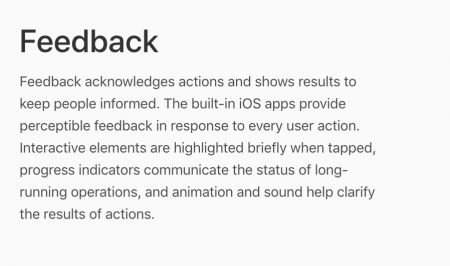
So people need to receive feedback when they use a product. It’s not enough to create a product that does what we think it does. Apple talks about how feedback functions in their app development.

Feedback design principle. 

 Haptic Feedback

In UX design, haptic feedback is touch-based feedback that lets a user know there’s an error, an update, or an important notice. It’s what makes your phone vibrate when you touch a certain key, what makes your video game control vibrate when you’re interacting with the game. But really, all good user interface involves appropriate feedback. Users should be:

  • Properly led through a cycle
  • Able to tell how close they are to a goal

Feedback can come in many other forms:

Feedback shows the user where they are, where they’re going, and how close they are to getting there. 

 Loading bar example.

Loading bars let the user know that something is happening in the back end, but progress bars tell them how far away they are from getting where they need to go.

Progress bar example.

 Where to Go From Here

You don’t have to change your entire methodology, but you can incorporate some tools from human centered design into your own plan. 

  • Evaluate your current process
  • Develop a persona for your clients to better understand their challenges
  • Develop a productive brainstorming session to generate new ideas
  • Pitch your plan by illustrating your ideas
  • Share your design concepts with your team
  • Explain your value proposition
  • Explore potential risks
  • Discover your differentiators
  • Ask for feedback from the group you’re hoping to serve
  • Get back to the grindstone and refine

The most important lesson to take from human-centered design is that you should keep things fluid. Don’t get tied to a particular methodology, don’t stubbornly refuse to innovate, and always keep your goals in line with the heart of the matter. Put humans above the bottom line and you’ll never go wrong. 

Get the Most Out of Google Analytics

googleanalytics01Google Analytics is awesome because you can see how people interact with your site, discover how they found you, and figure out how old they are. Even if you don’t have an account right now, you can get one ready for a revamp. All of this information is necessary for creating a solid marketing plan, updating your site, and connecting with potential customers. You might find that you’re not reaching your target audience and you need to make some tweaks. 
How Google Analytics Works

tracking-code-overview-google-analytics-google-developers

Google Analytics collects data by sending out an HTTP request, which includes important information about your specific site. Analytics creates first-party cookies to gather info about ads, sessions, and to track how long users stay on your site. So basically, once you put the Google Analytics code onto the back end of your site, it will log and track user information. If users have cookies blocked, Google Analytics won’t track all of their behavior. Keep in mind that users also won’t be able to use the majority of web apps, so don’t worry– most users will have cookies enabled. Check out Google for more info on how tracking works.  

Most Important Google Analytics Features 

Audience Overview

The audience overview gives you a bird’s-eye-view of how people are interacting with your website. Audience overview shows you demographics, interests, and location. Toggle between “hour,” “day,” “week,” and “month” to review how these interactions change. Notice a pattern? Are more people visiting your site when you release a new blog? Was there a major drop-off after a long period of inactivity? Take notes and recognize patterns that increase visitors. See if you can replicate that time after time. 

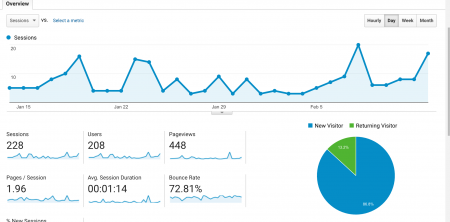
Audience overview analysis from Google Analytics.


Acquisition Reports

This shows you what brought visitors to your site. You can see what keywords people used to get to your landing pages, whether people were referred to your site from another page, you can link your AdWord campaigns, and you can track your ad’s performance. 

Behavior

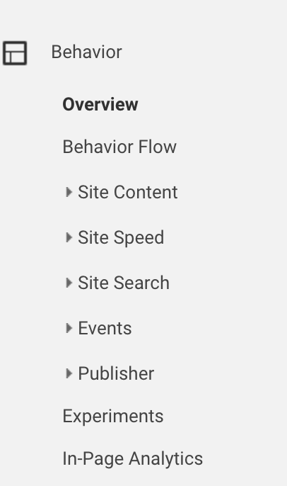
Behavior is where you’re going to find what pages people click on, how long they stay on that page, the bounce rate (remember, this is the percentage of people who checked out this page and then bounced), and entrances and exit rates (the percentage of people who enter your site on a given page and the percentage of people who leave after being on that page). You can also check out site speed, site search, and event overviews. 

Behavior Analytics from Google Analytics

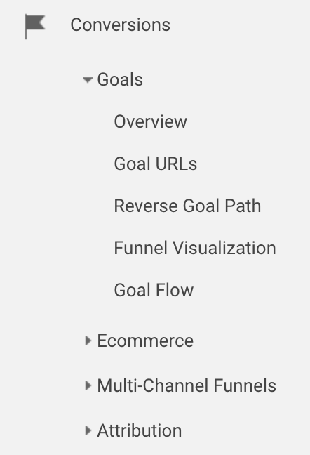
Conversions

Conversions are great because you can check out your goals, eCommerce page, and your attributions page, which lets you compare the source of your conversions. 

In-page analytics from Google Analytics. 


Set Up Goals

Once you know your way around Google Analytics, you’ll want to set up goals so you can get the most out of your web interactions. 

Go to Admin > Web View > Goals   

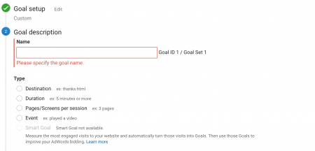
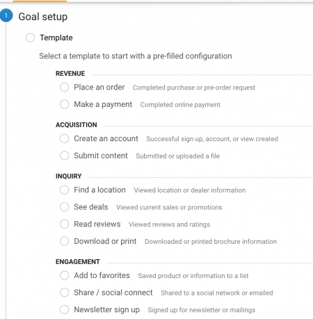
 Choose from one of the pre-defined templates to create a relevant goal. If you want something more specific, create a custom goal. Click on the “custom” button, name your goal, and define the parameters of your goal. 

Goal setting on Google Analytics

analytics

Once you have goals set up, you can keep track of the percentage of goals that are successful. Goals can help you track the following:

  • Leads
  • Conversions
  • Newsletter sign ups
  • Downloads

You can track goals through the following methods:

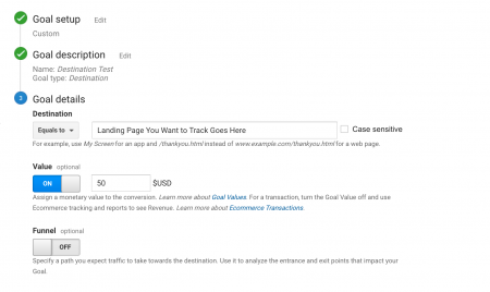
1. URL destination goals

analytics

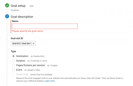
Goal Name: Name your goal.

Goal Type: Set your goal type. This goal is going to be a destination-based goal, so we checkmarked the button next to “destination.” 

Analytics goal set up.

You can enter goal values to track a specific number or payment. 

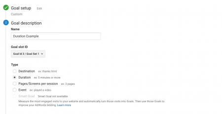
2. Visit duration goals

Goal Name: Name your goal.

Goal Type: Set your goal type. This goal is going to be a duration-based goal, so we checkmarked the button next to “duration.” 

Goal duration in Google Analytics.

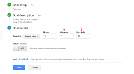
Click “next.” Add a duration to track. Do you to see if people read the entirety of your 5-minute blog? Do you want to see if they spend more than 10 seconds on your page? Enter the amount of time here.

goal-duration-part-2

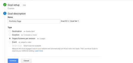
3. Page/visit goals

If you know people usually visit a specific product page before checking out, create a page goal to track the visitors on that page. 

How to set up a page goal in Google Analytics.

4. Event goals

With event goals, you can track and see when people do the following:

  • Add a product to the shopping cart
  • Click play on a video
  • Click to share the page on social media
  • Download an ebook

 Set Up Segments

Segments consist of filters that you create to track interactions. Segments make it easy to track users who find your site organically, track users who come through a paid search, or track users who made a purchase. You can also import segments that Google created so you can properly track users. You can quickly import new segments like “new user starter bundle,” “SEO Dashboard,” to track high and underperforming pages. 

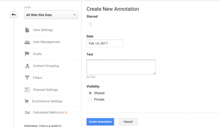
Set up Annotations

Annotations are notes you can add to help track what’s happening in your business. You can add competitor notes (include competitor’s sales, large launches, and so on) to place it against your web traffic. If your competitor launched a new shoe line and your shoe company notices a 10% drop in web traffic that day, you can assume it’s due to the competitor’s launch. 

Add annotations for Google Analytics.

Make sure to mark some of the following dates and info on your annotations:

  • Launching new products
  • Site down for web maintenance
  • Releasing new product
  • Pulling old product off the shelf

Annotations help you remember what happened, when. To create annotations directly from your overview pane, click on the down arrow underneath your overview pane. 

Audience overview and how to add annotations on Google Analytics.

Find out how people navigate on your site.

This is one of the most important sections in your GA account because it tells you how people get from A > B. If you’re selling shoes, how do people get your site? And if they aren’t buying your shoes, is it because they’re stuck on a specific page? See how to check out user interaction below. 

Users Flow

To access, log in to your Google Analytics account. If you don’t have an account yet, you can sign up for one pretty easily. Once you’re logged in, you can access your GA code, which is unique to your site. This code needs to be placed on the back-end of your site so that Google can actually track how users interact with it. More information on getting your GA code onto your site is here.

See where people leave your site.

Google Analytics shows you where people drop off from your site. You can review bounced sessions, conversions, purchases made, and mobile traffic. 

Your bounce rate is the percentage of people who bounce off your site at the page the came in without stopping to check out any other pages. You can still have a high conversion rate while having a high bounce rate. 

The exit rate include people who leave your site after checking out a few pages. 

Once you know the way people navigate your site, you can create a better user experience by updating your content, adjusting your navigation, or making it easier for users to check out.

Set up Tag Assistant

Tag assistant gives you real-time feedback on your pages. You click “record” and click through the pages on your website. Tag assistant shows you suggestions about non-standard implementation and pageview requests. You can only use tag assistant on a page that has a GA code, so if you’re already set up on Google Analytics, you’re good to go. If you haven’t yet set up a GA account, do it before you attempt to track with tag assistant. 

Tag assistant instructions for Google Analytics  

Smart Tips

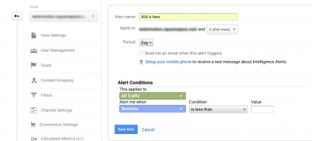
Set up an alert to monitor you of 404 errors.

First, set a 404 error goal. Go to Admin > View > Goals > Destination > Use your static 404 page as your URL 

Go to Admin > View >  Alert 

How to create a 404 alert in Google Analytics

Next to “Apply to”: Enter the static 404 page

Checkmark “send me an email when this alert triggers”

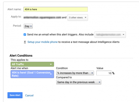
Under “Alert Conditions” > Click the dropdown and find the 404 goal you created

Your alert should look something like this:

How to create a 404 alert on Google Analytics.

Then you can track alerts over email, fix issues as soon as they arise, and make sure everything is working properly. 

Recap

Google Analytics is a powerful tool that, when used properly, can help you see your site’s weaknesses. Log in to your account, get settled with the most common features, set up alerts and segments, and start tracking how users interact with your site. You’ll be a Google Analytics whiz in no time. And if not, there’s always Google’s help page

Editing Tips for Blogs

Hands typing at a computer.

If you haven’t been getting the response you like from your blog, it might be time to get to editing. The issue might not be with the content, it might be with the form.

Writing a solid blog isn’t about using the coolest tips and tricks and it’s not about slamming everyone with a bunch of slang. It’s about making sure you can create legible text that your readers will actually enjoy. So let’s look at some ways to do that.

Trusted Blog Formats

Inverted Pyramid

We’ve all seen the inverted pyramid in action. This was primarily a journalist’s idea, since it kept the most important information above the fold. In web writing, there is no fold. There’s the scroll.  And every time someone has to scroll, their ability to lose interest in the piece goes up.

Here’s the deal with the inverted pyramid:

  • Keep the most important information up front. Who, what, where, when and why. Boom. Knock it all out right away so everyone knows what’s up.
  • Don’t hide the most important information. If you have a story to tell, place it in the headline and lay out the details before the scroll.
  • If you are writing a longer article, you may need to use the inverted pyramid technique multiple times.
Tips for Holding Interest:
  • Connect differing ideas with numbers, not long-winded text.
  • Remind readers why it’s interesting.

Check out the example below from The New York Times:

Art World Annotated - Inverted Pyramid

This is a style piece, but we get everything we need right away. We know who the article is about, why it’s being written, where it’s taken place, and what we’re going to learn. 

So why is this cool? Because Neilson Norman Group says so. And because it helps people get the information they need faster.

Here’s the idea: get to the facts, get to them fast, and then let people go. Web readers are busy. They normally don’t want to spend tons of time reading. So see what your form is doing. If you’re not using the inverted pyramid method, it may be time to flip your writing upside down.

The Single-Sentence Approach

We like to call this the salesman approach because a lot of salespeople use it. It’s when you pretend like paragraphs don’t exist.

Do you know what happens to readers when you split up paragraphs?

How about when you separate sentences? Do you think readers get more excited when they see ellipses…

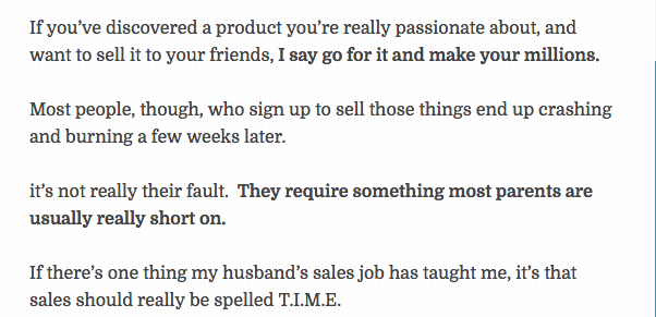
Example from Incredible Infant.

26-ways-to-earn-money-at-home-without-selling-incredible-infant1

Guess what…

That might be a little too much! When people write like this, it can come off as super salesy because it plays with a false sense of anticipation. See whether you’re doing this in your text. If you are, it might be just about time to change it up. Chunking your paragraphs and alternating the style is helpful.

 The Perfect Paragraph

What’s the holy grail of paragraphs? It depends on who you ask. Smashing Magazine is all about design, so they approach the paragraph from a designer’s perspective. They mention a few things:

  • Use Bitstream to download the proper font family
  • Choose a font that is easily legible. Smashing Magazine notes that

    A diminutive x-height, for example, could impair the readability of a font from either camp. Some serif fonts are highly legible and attractive for paragraph text if they are set properly. Matthew Carter’s screen-sympathetic Georgia is a case in point.

From a content perspective, there’s a bunch of stuff you can do to write better paragraphs:

  • Vary your paragraph length. Write 3-sentence paragraphs followed by 2- and 4-sentence paragraphs.
  • Chunk your text by grouping your paragraphs around a single theme, issue, or thought.
  • Don’t indent your paragraphs.
  • Make each paragraph relate to the others thematically.
  • Check that you have clear topic sentences (reminder: topic sentences are the first or second sentence in each paragraph. They let readers know what the entire paragraph is going to be about).
  • Make sure your paragraphs meet reading-level requirements.

The Perfect Headline and Subhead

Of course, there are formulas that work. There are entire books written about the topic. There are many people who will tell you things like:

  • You need to include numbers in your headlines because posts with numbers get read more
  • You need to include the problem you’re solving in your headline
  • You need to keep your headlines short
  • You need to include your brand name in your headline
  • Put the main story in your headline

And those are all important tips, and while your headline might be on point, you shouldn’t forget about the importance of subheaders. To create the perfect subheader, think about placement.

  • Write a new subheader any time you change tracks, subjects, or main ideas
  • Write a list to section off the subheaders that you want to add

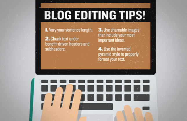
Blog editing tips for refreshing your blog.

So go ahead and try reformatting your blog a bit. If the content’s fine, you may need to refocus your goals and check out your form. 

Seen enough? Get An Estimate