October Congratulatory Round Up

A lot’s been happening with our clients, and we wanted to congratulate them in their many successes:

We’d like to congratulate Dress for Success Wichita on receiving Net-Ability’s 2015 Not-for-Profit Technology Grant. Dress for Success supports women in the Wichita area by helping them become economically independent.

We’re still excited about Atlas.md’s Direct Care Curriculum — a 12-lesson curriculum that helps doctors open their own direct primary care facilities. Check out the curriculum here. Atlas is Wichita’s leading Direct Primary Care facility, and they are dedicated to providing high-end, personalized medical care and direct primary care education.

We’d like to congratulate Nai Martens as they team up to support the Pinnacle Lofts and the Wichita Downtown Development Corporation in the building of new urban apartments for downtown Wichita. The apartments will include a bike-share program, on-site laundry services, and smart-key technology for added security. Construction is projected to be completed by the spring of 2016. NAI Martens is the largest commercial real estate firm in Kansas, and they offer a variety of real estate solutions from acquisition and consultancy to valuation and corporate solutions. To learn more about NAI Martens, their brokers, staff, and their real estate services, visit their website today.

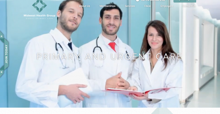
We’d like to congratulate Midwest Health Group on their updated website. Midwest Health Group is a direct primary care facility serving Kansas City.

We’re always excited to share in our clients’ successes! Feel free to send any news to info@entermotion.com.
Websites, Social, or Word of Mouth

thumbnail

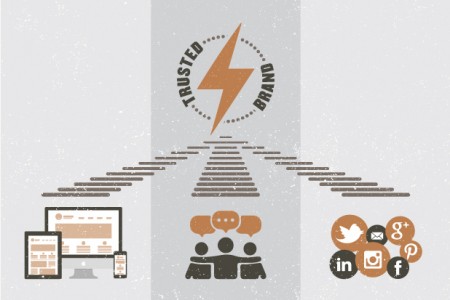
We heard a debate the other day that involved what’s more effective: websites, social, or word of mouth. We wanted to settle the debate once and for all. They are all important and they should all be utilized in order to create a trusted brand. 

A New Version of an Old Trick

Word-of-mouth marketing doesn’t function like it did 20 years ago (obviously!) A lot of word-of-mouth sharing takes place over social media and websites, so in a way, word-of-mouth advertising and social media advertising are parts of the same thing.

The Statistics

“92% of consumers believe recommendations from friends and family over all forms of advertising.” (Forbes)

“66% of respondents under the age of 34 are more likely to give a referral after receiving social recognition.” (Software Advice via Referral Candy)

56% of B2B responders use word-of-mouth marketing to “find information[al] advice.” (I-Scoop)

A Market Force study found that “81% of U.S. consumers are influenced by their friends’ social media posts.” (Market Force)

“75% of users admit to making judgments about a company’s credibility based on their website’s design.” (Sanford Study via Kinesisinc)

Stay True to Your Brand

Essentially, these are all parts of one whole. If your website isn’t strong and if your social media campaign isn’t true to your brand, word of mouth isn’t going to do much for your business. The first thing people normally do when they hear about a company is Google it, so make sure that whatever they find in those search results reflects your brand, your tone, and your overall vision. That way, word-of-mouth marketing, social media marketing, and your website will create one unified experience for the user.


Inspiring Mission Statements

Writing an inspiring mission statement can be difficult, but we scoured the web to find some of the most inspiring mission statements that we could. Notice the lack of jargon and the incorporation of clear and truthful information.

Pinterest: Pinterest is a place to discover ideas for all your projects and interests, hand-picked by people like you.

Quirky: We make invention accessible. We believe the best ideas in the world aren’t actually in the world…they’re locked inside people’s heads. We exist to solve that problem.

Poppin: believes you should be able to surround yourself with objects of beauty everywhere you go and in everything that you do. Whether you are making grocery lists, taking notes at the latest TED conference, or pitching the next big account, you should be able to do it with a smile and style. This is why we exist.

Google: Google’s mission is to organize the world’s information and make it universally accessible and useful.

BOMB Magazine: has been publishing conversations between artists of all disciplines since 1981. BOMB’s founders—New York City based artists and writers—created BOMB because they saw a disparity between the way artists talked about their work among themselves and the way critics described it.

Apartment Therapy: We believe:  A calm, healthy, beautiful home is a necessary foundation for happiness and success in the world. Creating this home doesn’t require large amounts of money or space. It requires inspiration, connection to resources and motivation to do something about it. The basic elements of good home design can be learned and achieved by all. Simplicity and luxury are not mutually exclusive.

Writing a mission statement doesn’t have to be scary or time consuming or fearful. We like to go by what Ben Franklin said:

Either write something worth reading or do something worth writing.

You probably did something worth doing, now you just have to write it out. Happy writing!

Spotlight on Midwest Health Group

Midwest Health is a patient-focused direct primary care center serving the Kansas City area. They seek to offer affordable, quality care to patients, without forcing them to meddle in annoying insurance battles.


Direct_Primary_Care_for_Kansas_»_Midwest_Health_Group_-_2015-09-28_15.25.04

Study

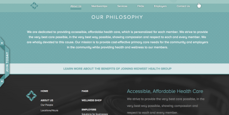
Midwest Health Group provides a lot of information to their patients — from FAQs and services to benefits for employers and businesses, we knew that we needed to create a corporate site that would be bold, sleek, and elegant so that users could navigate this direct primary care site with ease.

Affordable_Direct_Care_»_Midwest_Health_Group_-_2015-09-28_15.27.23

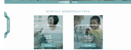
We incorporated bold images that would tie the site together — the masthead images appear later in the site to create cohesion that can only come from a wholesome design.

Affordable_Memberships_»_Midwest_Health_Group_-_2015-09-28_15.34.16

Color

MHG-swatches

We incorporated a mix of blue hues with white and black in order to create a sea-like feel that would be welcoming and calming. We wanted Midwest Health’s patients to feel as at home on the site as they do in the MHG office.

Services

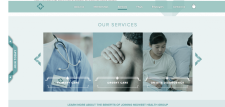
Midwest Health incorporates a variety of services in order to provide a truly unique experience to their patients. We incorporated a sliding menu to ensure that patients could easily locate the services they need. Since direct primary care is about serving the patient on their time, we made sure that this site enhanced the patient’s experience by incorporating user-friendly navigational items.


Membership_Services_»_Midwest_Health_Group_-_2015-09-28_15.38.09

We chose to work with Proxima Nova font because its geometric nature, paired with its slightly curved lines matched neatly with the design and slightly curved feel of the site.

Check out Midwest Health Group’s full site here. Check out our portfolio to see more.

Oct
01

Seen enough? Get An Estimate