Be Mysterious, Not Esoteric
If you’ve visited LA or NYC in the past few months chances are you’ve seen one of these strange billboards.
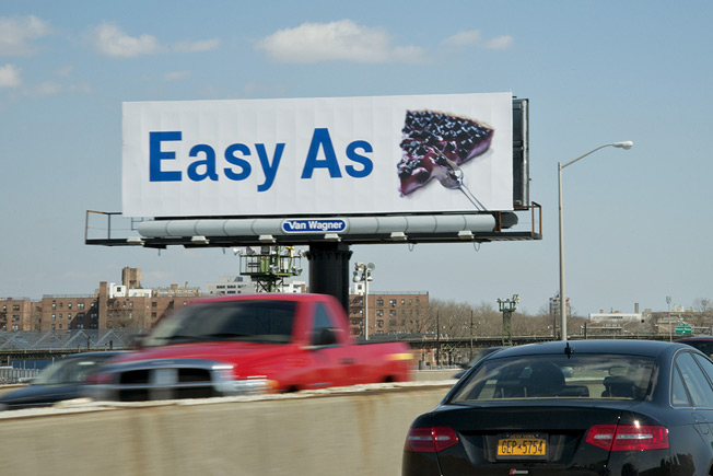
Is this high art? (Seriously, this might be the most non-functional thing we’ve ever seen)
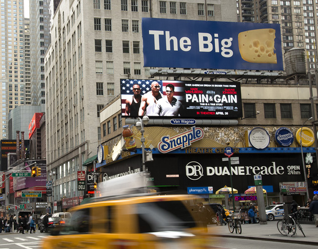
A ha, New York, the “Big Apple.” Clever… very clever…
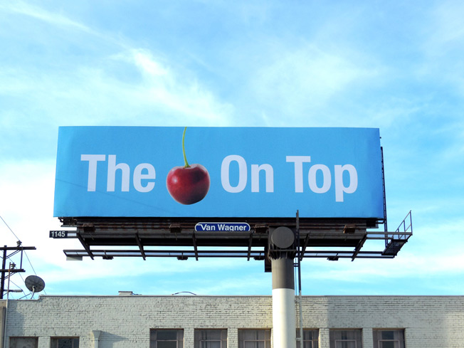
This one makes us kind of hungry…
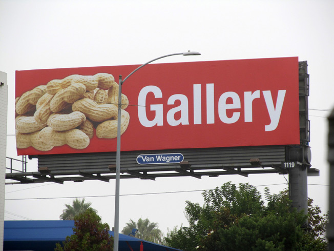
We see what you did there…
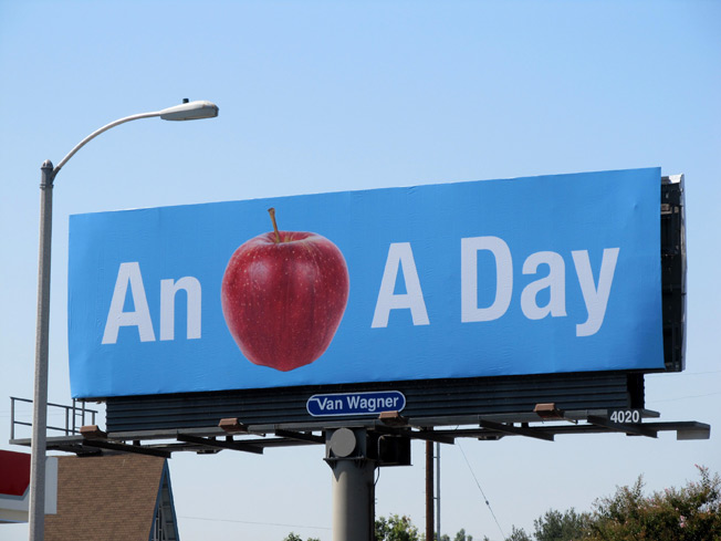
Oh, this is the teaser for a new doctor’s office, right?
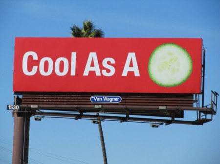
Where’s the URL? What are we supposed TO DO???
These esoteric ads stumped so many commuters that, finally, Ad Freak investigated it.
Van Wagner, the outdoor advertising company, created these billboards to advertise advertising on billboards. Whoa, that’s meta. It turns out that if a billboard isn’t sold, its owner gets to keep the old ad up (which devalues the space), leave the board blank or put up placeholder creative. Van Wagner went with the latter, and decided to dress up the plain ol’ “Your Ad Here” sign. Or dress it down.
The company’s in its second round of posting curious ads on unsold billboards in New York and Los Angeles. Ad Week muses, “Prettier and more compelling than ‘Your Ad Here’? Yes. Confusing as well? Perhaps.” That’s putting it lightly. We DEFINITELY would be confused if these sprang up near out office in Wichita. To compare, the first round of Van Wagner ads were more straightforward. These boards showed animals with copy that tied in visually with relevant media language (“Reach?” next to a giraffe, “Buzz?” next to a bee, etc.). These ads included Van Wagner’s logo and phone number.
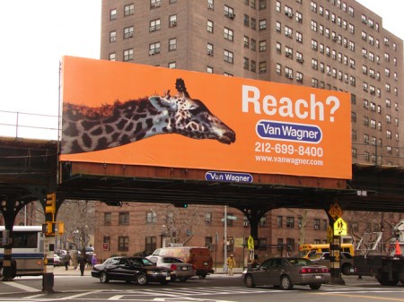
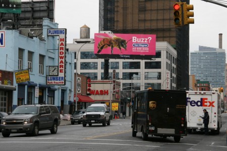
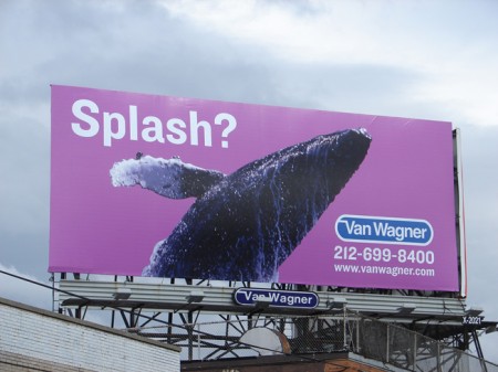
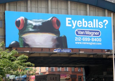
The new ads are playfully pop-art, but who knows if they’ll actually get someone to place media on Van Wagner’s boards (although they were interesting enough to get us to blog about them, so that counts for something). But are they good creative? We’re not sold on that. Sure, the first rule of good creative might be break all the rules. Famed graphic designer David Carson exemplifies this behavior; he’s now designing rooms for the Ace Hotel in Portland, and speaking for sold out crowds at Weiden + Kennedy. However, there has to be a rule in order for it to be broken.
If your campaign needs to build curiosity, be mysterious, not esoteric.
Sometimes your campaign demands that you build curiosity so that consumers can be rewarded with elements of surprise. The goal is to lead consumers somewhere, whet their appetite for something. A great example would be the ad campaign leading up to the theatrical release of The Dictator starring Sasha Baron Cohen. However, this type of ad only works because the actor portraying the title character is well-known (and targeted digital advertising led people to the movie’s website where people could learn more about the film).
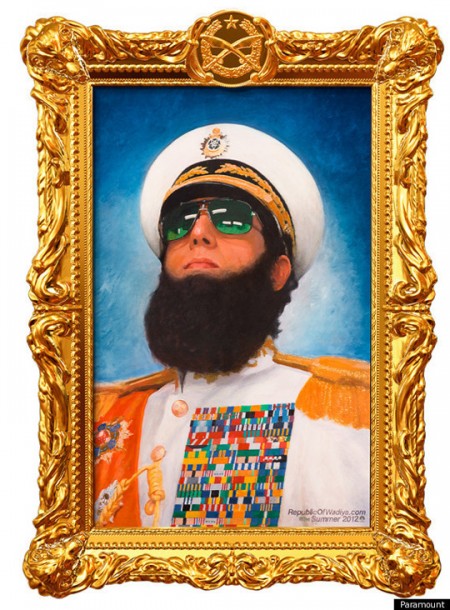
This creative ran on bus shelters with no copy, no CTA (image courtesy of Paramount.com)
Even if you’re just doing a sale landing page for a small retail store, or inviting sales reps to come and check out your new offering, it’s worth looking at your creative and asking, Is my message clear to the people I’m speaking to. Yes, you can be mysterious (maybe you have something VERY exciting to reveal). But don’t be esoteric. That new feature you’ve added to your online store might make sense to you and your web team, but if you name it something like “Auto Universal Sizing” you can get into trouble (this might be a feature that would default to a customer’s preferred shirt size of Medium when adding apparel to their online cart). Messaging about your new “Auto Universal Sizing” can sound like your clothes are automatically made large enough for a galaxy. That doesn’t bode well for consumer perception.
Having a good relationship with a design studio means your creative looks sharp, communicates clearly. You can trust our opinion. If we think a message lends itself to more “huh?” and less “yeah!” we’re glad to help you rework it. Remember: Mysterious creative shows your good or service in such a light that people wonder about it. Esoteric creative makes people shake their head. Which is fine in an art gallery. But if you want people to buy your product or work with you, head shaking isn’t going to cut it.
All images appear courtesy of adweek.com unless otherwise noted