How to Fix the Too-Much-Content Problem With Readable Content

We want to save you from TL;DR*.
We want to save your customers from feeling like they need to spend too much time digging through info to find the one fact they need. And finally, we want to help you write readable content that doesn’t overwhelm your readers.
Your landing page should lead people through your sales process easily.
The whole point of readable content is that it helps your readers follow your goals. You want to allow everything to lead up logically to the CTA, so it’s not about more content, it’s about incorporating content wisely. But doesn’t a longer page mean more information? And isn’t information what readers want? Er. Yes and no. Customers don’t care about slogging through content, they want specific, detailed content that’s going to tell them what they need to know right away. The customer comes to your site knowing nothing. It’s your job to explain to them what they should do, why they should do it, and what they’re going to get out of it. If you can provide that information in two sentences, don’t take 10 to say it.
Shift the type of content on your page.
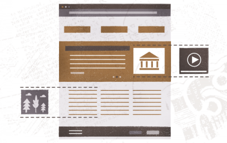
Let’s face it: readers want to scan. They don’t want longform sales pages. Use images to help customers scan the most important content, be led to the CTA easily, and leave with a solid understanding of your product. Images can help you do the following:
- create chunked content
- keep your readers interested visually
- tell your story through multiple mediums
- explain difficult processes with visual elements
Only incorporate a photo that’s doing the work of the content you deleted. The goals is to create a smooth landing page that will lead your readers to your CTA with ease, and if your picture is less functional than a Picasso in a moldy basement, it might be time to rethink it. Cut the content. Focus on the headlines. There’s no hard-and-fast rule for the time you should spend on a headline, but if you want to cut your content, you’ll want to make sure that your headlines are doing most of the heavy lifting. Your headline is arguably the most important part of your landing page because it’s the part that the most amount of people will read. And to make your headline the most effective, you should remember a few simple principles:
- Your headlines should incorporate the benefit — what are customers going to get by visiting your landing page or getting led through your process? No one cares what the thing does, they want to know how it’s going to help them.
- Your headline should be more logical than clever — clever is cute, but logic sells.
On the average, five times as many people read the headline as read the body copy. When you have written your headline, you have spent eighty cents out of your dollar. -David Ogilvy
The important thing to remember is that if you provide dynamic, engaging content, clear headlines, and content chunked with appealing images, your readers are going to stick around and they’ll help you hit your goals. The goal of the landing page is to make the sale; so while creativity is going to be important, you have to keep your eye on the goal, and help your customers do the same. *TL;DR stands for too long; didn’t read