Spotlight on Cornejo
Visionary. That’s what we think of when we think of Cornejo, a company with a variety of subsidiaries, plants, and locations. What sets this company apart? Well, everything. They’re long lasting, involved in the community, and they seek to engage with the environment in sustainable ways. Their team is large. Their goals are large. And their excitement is immense. So what did that mean for us? It meant that we had to create something that was truly powerful, but subtly so.
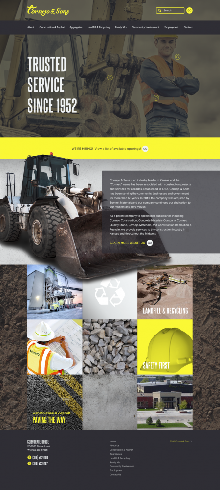
If you look at concrete being poured, asphalt being laid, or buildings being demolished, the first thing you think of probably isn’t peaceful. But there is something peaceful and even beautiful about a company like Cornejo & Sons — they take one structure, piece of land, or space, and they transform it based on rigid expectations and goals. And they sort of do it all with ease. We think that their video masthead, the almost invisible vignette, the scope of the site, and the colors we incorporated point to just that — subtle, powerful beauty.
We’re not trying to toot our own horns or anything, but we think it’s important to discuss and explore the process. Normally, that process starts with the bigger picture and trickles down to the final product.
We sort of like to follow this advice from Petrula Vrontikis, a graphic designer: “Practice safe design: Use a concept.” – (via Skill Crush).
We all know that aggregates are powerful and essential. We tried to distill that idea down into a site that would have multiple moving parts that all work together to create one well-organized final product. A site that would allow Cornejo and all their subsidiaries to present themselves as the powerful team that they are.
For One, For All, For Better
We like pushing ourselves a little bit more with each project, and we’d like to think that we pushed ourselves a bit with our video editing experience and our ability to compress a concrete ton (get it?) of information into a site that would be easy to navigate and not coarse to look at. Sorry for all the construction jokes…
And let’s face it…we got pretty excited about color correcting the images so they were a bit closer to the logo. Sometimes, it’s the little things that really get us pumped. We were excited that we got to work with Hanson & Wright, who managed, planned, and coordinated the project and the project resources, and Copp Media, who handled all of the SEO details and worked on social media and architecture with us. Check out their new website here.
