Spotlight on Southwestern
Process
 All colleges are different so it depends on the university and the Proofessor in the colleges— some are required to go through their university’s media resource center for websites, and others are able to shop around and work with a webdesign firm. Each produces a different result, but when we worked with Southwestern’s admission site, we had a unique opportunity to blend easily navigable designs with elements from their main page. We first made note of the design elements on the parent site — the unique hover-colored menu, the sectioned-off spotlight categories, navigation categories, the font type, background colors, and color scheme. Then, we applied those elements into our new design in order to highlight some of the cool opportunities that Southwestern offers.
Study
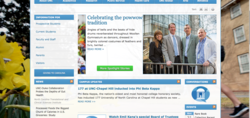
 Many schools have different designers for their main pages and their admission pages, so it creates a dissonant design that confuses prospective students. Take the University of North Carolina at Chapel Hill for example. Their admission site lacks many of the design elements that the main page has — they have different backgrounds, different menus, and a different color scheme — there’s no continuity. And if a website isn’t easy to navigate, users are more likely to leave the site quickly. An important thing is that the website is well written and with good content, We made sure that Southwestern’s admission site was customized to their needs and fit in with the rest of their content seamlessly.
Challenge
Because of the size of the site, we knew we needed to push the boundaries to make sure all of the content would be highlighted properly and each subpage would be easy to access. We designed a fully responsive website and a custom CMS so that users could focus on the important information and colorful design no matter their device. We also wanted to streamline the editing process for Southwestern, so each department has the ability to edit and manage their own content.
Solutions
School Spirit
 Southwestern’s colors are black and purple to reflect their Halloween-like mascot, the Jinx. So when we were designing the admission site, we knew we wanted purple to play a large role.
Font
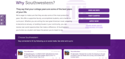 We chose Museo’s font family because we liked that the typography was a little bit open, a little bit authoritative, and even a little bit casual. We also wanted to ensure that the admission page was part of the whole, so we had to make sure our font matched the font on their parent site.
Readability
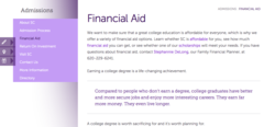 One of our biggest challenges was making sure the most important content stood out. We made pull-quotes in purple so that students could quickly see some of the coolest facts and stats that Southwestern boasts.
Navigation

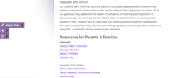 We made it simple to navigate this site. Because there’s tons of content, we had to make it possible for people to scan at their convenience. Southwestern’s new homepage showcases some of their most important information — from application help and financial aid information to campus life information and social media connections, we wanted the homepage to have it all laid out. This site stands out with a scrolling social media section, “ask an admission officer” feature, staff directory, and a scrolling menu to highlight SC’s most important links.
Directory
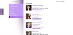 We created an easily searchable directory that would allow prospective students to connect directly with an admission counselor or staff member.
As Strong as their Students
Southwestern is dedicated to providing a quality education that allows its students to go beyond the borders of the classroom and discover what’s important to them. We loved working with Southwestern on this website redesign. Check out their full admission site here.