Congratulations to Murphy Tractor!
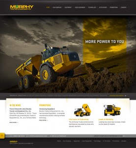
Murphy Tractor Website HomepageWe’re so excited to announce the launch of the newly redesigned Murphy Tractor website!

We’ve worked with Murphy for a long time – they were actually one of the first websites we had the privilege of building. So getting to redesign was a special kind of fun for us – not to mention a true testament to how much we’ve learned over the years.

The Murphy marketing team was great to work with, as always; we appreciate their desire to make their website a user-friendly, extremely helpful, all-inclusive place for their visitors. We wish them the best of luck as they continue to expand. Now their website is capable of growing with them!
Nov
21

The Power of Asking Questions

We know there’s such a thing as asking too many questions. But there’s also the flip side to that: not asking enough questions. We do our best to infer information and read between the lines to find out what our clients really want, but when it comes down to it, guessing isn’t a viable option.

So we just ask.  (more…)

Measuring Success

How do you measure the success of your website? Do you track analytics, and compare the number of unique visitors you receive each month? Do you track conversions made on your site? Do you track the success of your Adwords campaign? Do you analyze the actions people are taking on your landing pages?

All of these methods are well and good – and we advocate for them! But if you feel like you just don’t have enough information, or if the information you do have isn’t organized the way you’d like, don’t count yourself down and out just yet.  (more…)

Something New From Twitter

We heard about a new feature on Twitter, and thought you all might like to be in on it, too.

Read the details here.

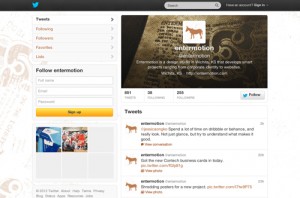
Introducing header images for your Twitter profile! Like it? Want one? No problem, let us know; we’re happy to help get you set up.

What is Responsive Design?

It seems like responsive design is finally making an appearance in the mainstream. We’re getting asked about it pretty often now. So what is it?

Before we jump into what it is, let’s talk about why it is. In the old days of the web, there were only a few screen sizes, and all of them were small. It was no big deal to design a site 760px wide, and leave it at a fixed width. If you were lucky enough to have a monitor bigger than 800×600 you just saw a little more border.

Soon though, display sizes exploded. An 760px website on a 27″ Cinema Display looks like a postage stamp on a letter. Websites got bigger.

Meanwhile on the other end of the spectrum, screens are getting smaller than ever before. You could see website content in some forms on mobile devices for years, but internet usage really took off when the first iPhone was released. It had a 480×320 screen. Your website probably worked, but it required a lot of pinching and zooming.

The first answer was the only answer anyone new: build a website for each of the devices you care about. But where do you draw the line? (more…)

Seen enough? Get An Estimate