Mini-Mac Spotlight
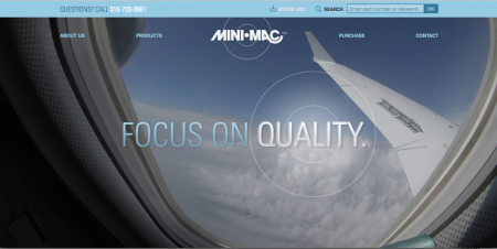
When Mini-Mac, a Wichita-based spacer manufacturer came to us about creating an entirely new website, we were excited. It was their focus on transparency, reliability, and integrity that drove our vision for this site’s copy, design, and aesthetic.
Process
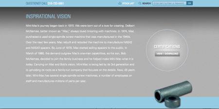
Mini-Mac has been locally owned for over 45 years, so we wanted their website to have a bit of the family-oriented feel while remaining classy and minimalistic.
Challenge

Because this is Mini-Mac’s first site, we knew we needed to incorporate a flawless design that would include both their history and their extensive product line.

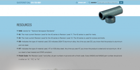
Mini-Mac values transparency and education, so we developed a search tool that would allow customers to receive updated inventory information. We also wanted to promote Mini-Mac’s educational spirit by incorporating a list of resources to help prospective buyers. Everything on this site– from the down-to-earth copy and the easily searchable directory to the updated resources and the spacious aesthetic is geared toward educating and informing prospective buyers so they can receive friendly, reliable information about the spacers they need, quickly.
Design
We were inspired by the cool metallic nature of the spacers, and we wanted to create a site that was as flawless and well-rounded as the spacers that Mini-Mac manufactures.
Colors

We shift between slate gray, blue and white to mimic the sheen of the NAS42 and NAS43 spacers and to provide a boundless quality to the site.
Font

We chose Univers LT because it’s lightweight and approachable, yet still serious.
Trusted. Reliable. Honest.
We loved the challenges and opportunities that occurred during our Mini-Mac design, and we’re excited to see what the next 45 years will bring for them! Check out Mini-Mac’s new website here.