What is Responsive Design?
It seems like responsive design is finally making an appearance in the mainstream. We’re getting asked about it pretty often now. So what is it?
Before we jump into what it is, let’s talk about why it is. In the old days of the web, there were only a few screen sizes, and all of them were small. It was no big deal to design a site 760px wide, and leave it at a fixed width. If you were lucky enough to have a monitor bigger than 800×600 you just saw a little more border.
Soon though, display sizes exploded. An 760px website on a 27″ Cinema Display looks like a postage stamp on a letter. Websites got bigger.
Meanwhile on the other end of the spectrum, screens are getting smaller than ever before. You could see website content in some forms on mobile devices for years, but internet usage really took off when the first iPhone was released. It had a 480×320 screen. Your website probably worked, but it required a lot of pinching and zooming.
The first answer was the only answer anyone new: build a website for each of the devices you care about. But where do you draw the line?
Luckily we have something called a media query. Essentially this lets a web developer make specific style sheet rules for individual screen sizes.
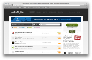
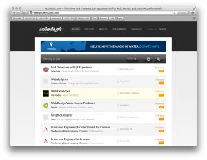
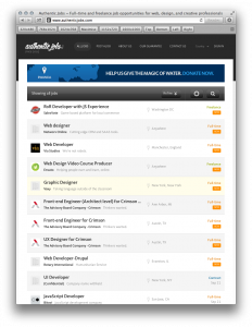
Although the trend had been brewing for a while, it really broke with the fantastic book by Ethan Marcotte aptly titled Responsive Web Design. We can pick on Authentic Jobs for an example. Here’s the site at a few screen sizes.
Notice how certain elements get resized, repositioned, or disappear all-together? If you visit the site in a browser, and drag the window to different sizes, you can watch the site morph or “respond” right before your eyes.
This is so powerful because you can tailor your user experience, not by designing 50 websites, but one. One set of content, one stylesheet, but with extra parameters to account for screen size.
As a client it’s important to understand that this will be more expensive. Your developer really needs to design individual layouts for all of the most common screen sizes. They also need to write CSS, and some code to implement those layouts. The good news is it’s less expensive than the way we used to do it, and is way more future-proof.
Q: So is responsive design right for you?
A: Budget permitting, it’s a definitive yes. But the best place to start out to answer that question is to look at your stats. Find out just how much mobile traffic you’re getting. If it’s substantial, go responsive. If it’s unsubstantial, there may be a reason why…
Q: Can an existing site become responsive, or do you have to start over?
A: In most cases you can add responsive rules later. Assuming your site is fairly modern.
Q: Can I build a site now, and then add responsive elements in next years budget?
A: Definitely.
Let us know if you have more questions about responsive design!


