Spotlight on Vieux Care
We’d like to congratulate Vieux Care, a direct primary care office based out of New Orleans, on the launch of their new website.
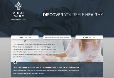
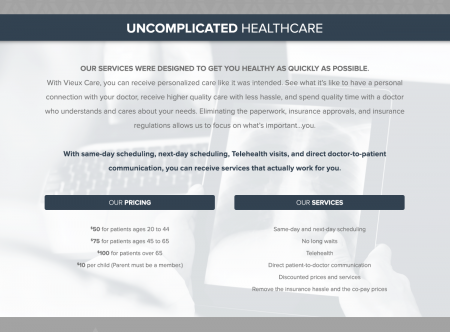
Vieux Care values the art in doctor-patient relationships, and we wanted to push the boundaries of what their site could accomplish. Because they value honesty, transparency, and near-immediate doctor-patient communication, their welcoming site incorporates a beautiful color palette, inspirational images, and three easy-to-navigate guidelines for how patients can receive care.
Study
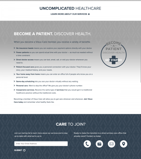
Vieux Care is a company that values the doctor-patient relationship, so we wanted to make sure that their site was healthy, clean, and well organized. We began by reviewing their competition and creating a plan that would allow us to approach this site from a patient’s point-of-view. Patients can receive immediate care from their doctors, and we incorporated white, easy-to-spot buttons that would allow customers to preview the benefits of joining Vieux Care.
Text
Vieux Care values the people of New Orleans, and we created text that would reflect their inner values— their ability to see fewer patients; their dedication to remaining hassle free; and their patient-focused care.
Color Palette
Vieux Care provides real care, and we crafted a color palette that would be calming nd welcoming. We know that joining a new primary care practice can be intimidating, so we made sure that the clean lines and streamlined feel of the site reflected Vieux Care’s ability to reduce hassles and remain patient focused.
Accessible
Elegant architecture, streamlined navigation, and subpages that build off of one another create a site that is full of easily accessible content. Customers feel welcomed by the color palette and the curved edges of the buttons, font, and the chunking of the various sections.
Social Media
Because of the nature of the site, Vieux Care relies heavily on social media interactions with patients; so we made their social media contacts minimal and easy to find.


