Spotlight on Brand Plumbing
Brand Plumbing has been providing plumbing solutions to the Wichita area since 1981, and we were excited to design a site that would show off their services and advance their mission — to provide reliable and trusted plumbing services to the Wichita area.
Challenge
Brand Plumbing was interested in both showcasing their plumbing services and providing educational resources to people in the Wichita community. Instead of creating a traditional corporate website, we wanted to create a bold site that would present their services alongside their educational resources.
Process
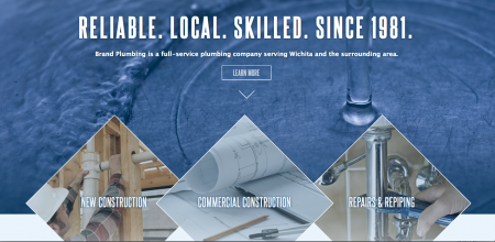
We pulled from Brand’s logo to create a website that would be informationally sound and aesthetically cohesive. We paired a diamond motif with deep ocean blues, light blues, and dark brown hues in order to create a graphic website that would evoke water imagery. The diamond reflects the clarity and transparency of Brand Plumbing and the wisdom of Brand’s plumbers.
Font
We chose Steelfish font for the headers because we wanted something bold and cool that would pop off the ocean blue background. The paragraph text is Lucida Grande because we wanted to create a light and complementary texture between the two fonts.
Outcomes
All of Brand’s information is now easy to find and properly located. We created space for their blog so they could record and present their best plumbing advice without interruption, we ensured that their logo was a darker hue than the rest of the content for easy navigation. Check out their full site here.
Check out our portfolio here.


